[ sole designer ]
A twist on a familiar pattern:A career path, not a list of jobs
I designed Veezo's profile from scratch, using the familiar résumé-style list as a proven starting point. The result keeps its depth, but turns the same data into a career path you can understand at a glance.
Context
Veezo is a professional networking app for people with networks too large to keep in their heads. It turns a messy collection of connections into something you can actually use.
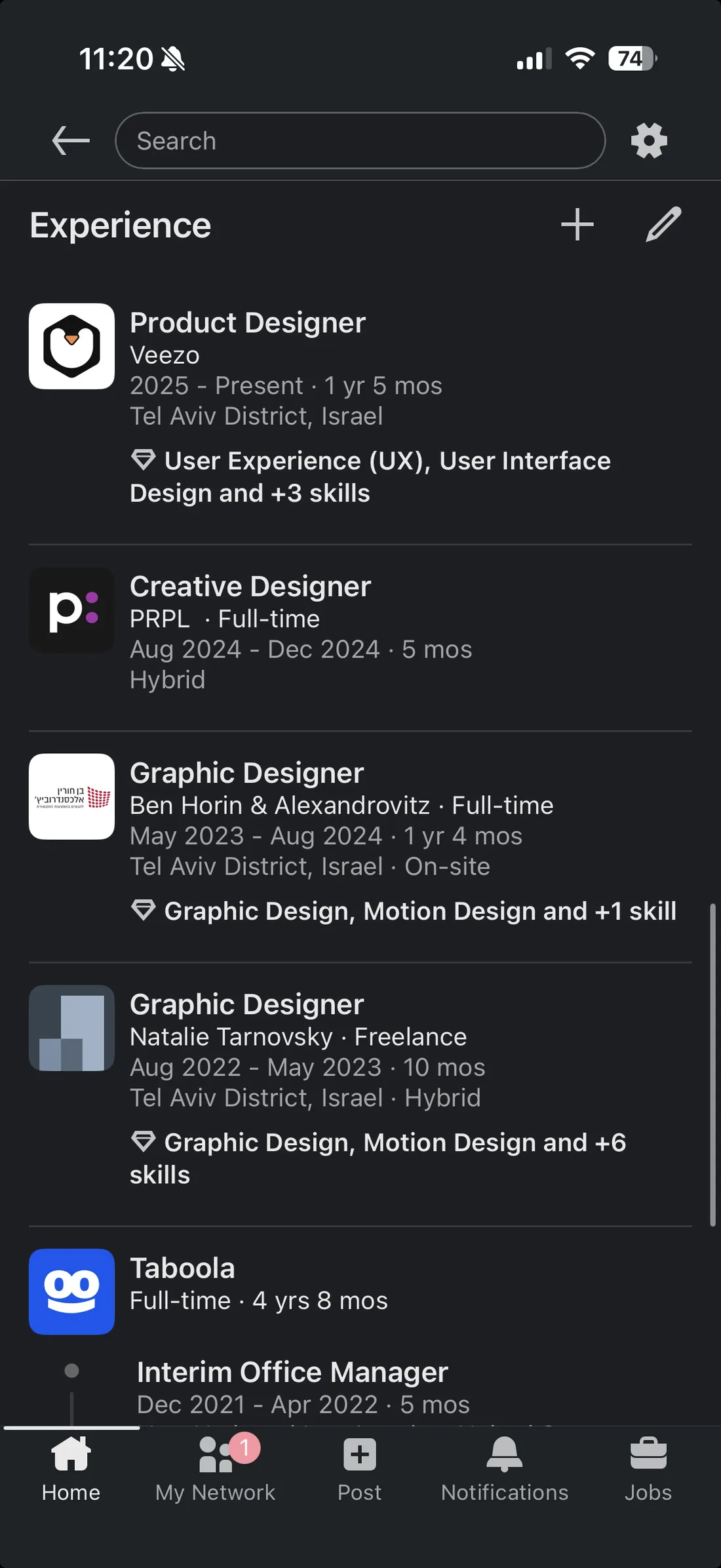
Most users already had LinkedIn profiles, so importing that data gave them a fast starting point. It also gave us a familiar design convention: professional history presented as a vertical stack of roles.
This wasn't a redesign of LinkedIn. It was a chance to question the default way professional data is presented - and turn the same information into a clearer career story.
LinkedIn gave Veezo both the profile data and its familiar stacked-list convention. This wasn't a LinkedIn redesign; it was a chance to question how that same information could tell a clearer career story.
The profile problem
The profile was where we started, because Veezo is built around people. LinkedIn solved the data problem: roles, companies, dates, and education were already there. The design problem was deciding what that information should help someone understand.
The familiar stacked-list pattern is useful for completeness, but it asks the reader to reconstruct the career story themselves. For Veezo, the profile had to do two things at once: make users feel represented by it, and help someone landing on it understand their path at a glance.
The opportunity wasn't to restyle the convention. It was to challenge it.
Two questions guided the design:
How might we turn a long career history into a clear first impression?
How might we make imported data feel personal, even in an MVP?
The stacked list preserved every detail, but left readers to reconstruct the story. Veezo needed a profile that felt personal and made a career path scannable in seconds.
Signal over noise
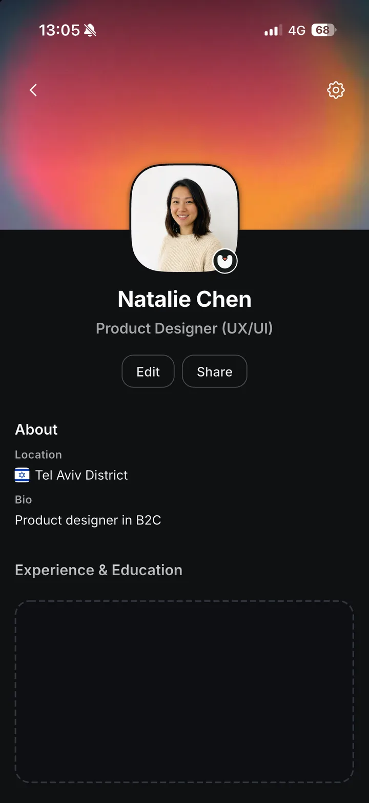
Remove first, then add back with intention. That became the principle behind the profile: strip the LinkedIn data down to the signals that tell a clear career story, then add details back only where they help the reader understand context, progression, or relevance.
The first layer was identity: photo, name, title, location, bio - centered, to put the person at the center, literally and conceptually. Before the profile showed career history, it had to feel like a person's profile, not a structured import.
Then came the harder part: experience and education.
Remove first, then add back with intention: strip the data to the signals that tell a career story, and put the person - photo, name, title - at the center first.
Finding the timeline
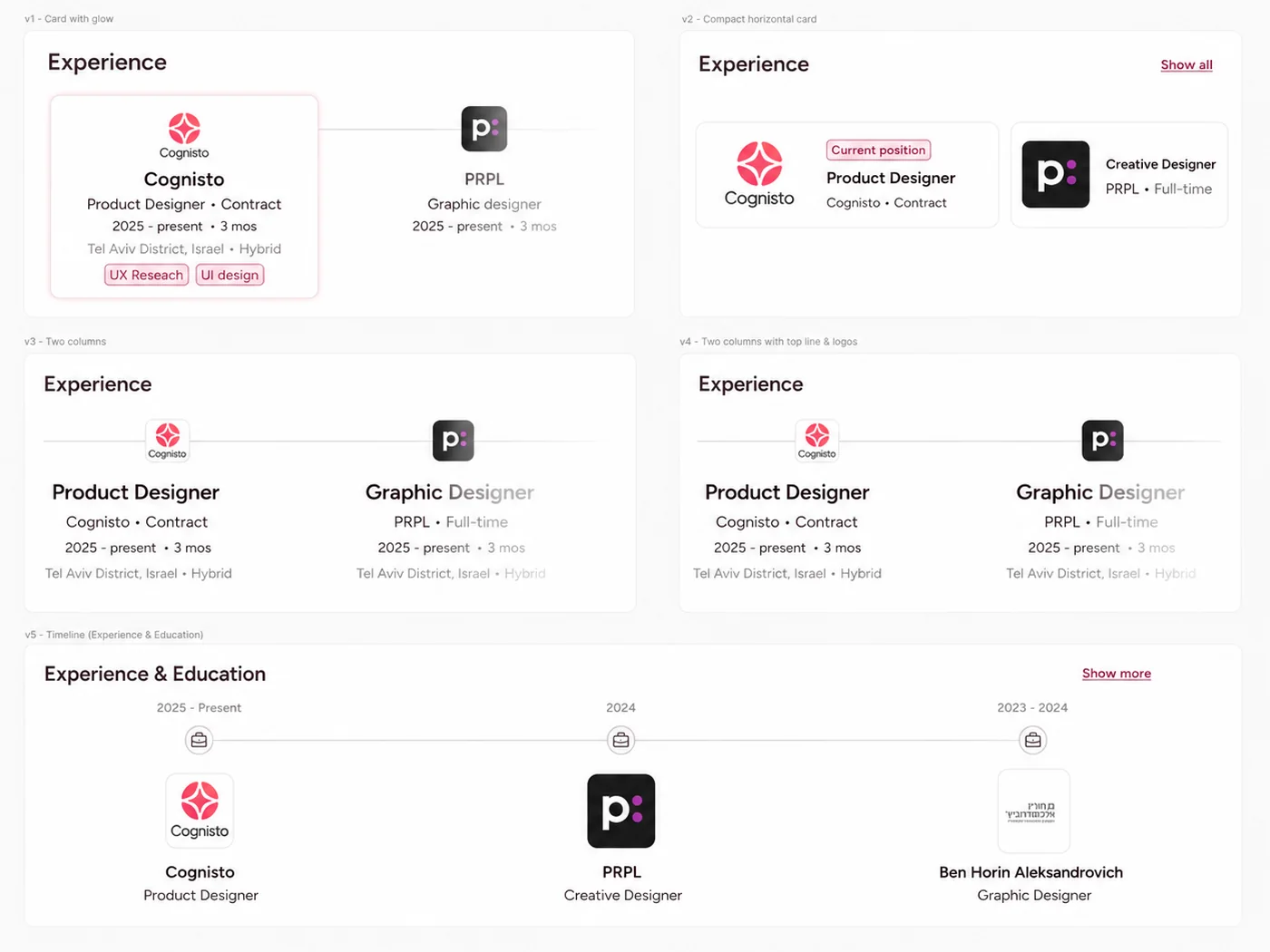
A vertical list would only recreate the résumé feeling. My first attempts used horizontal cards - cleaner, but they showed items next to each other without explaining how they connected.
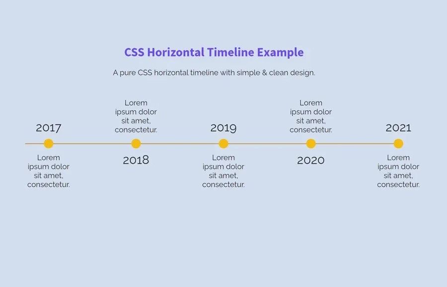
Then I found a very generic CSS timeline example: yellow dots on a line, lorem ipsum captions. It was ugly. Very ugly. But it captured what my cards were missing: the geometry of time.
A line. Anchored stops. Time markers.
The aesthetic was wrong, but the structure was right.
Cards couldn't show how roles connected. An ugly generic CSS timeline could - a line, anchored stops, time markers: the wrong look, but the right structure.
One combined timeline
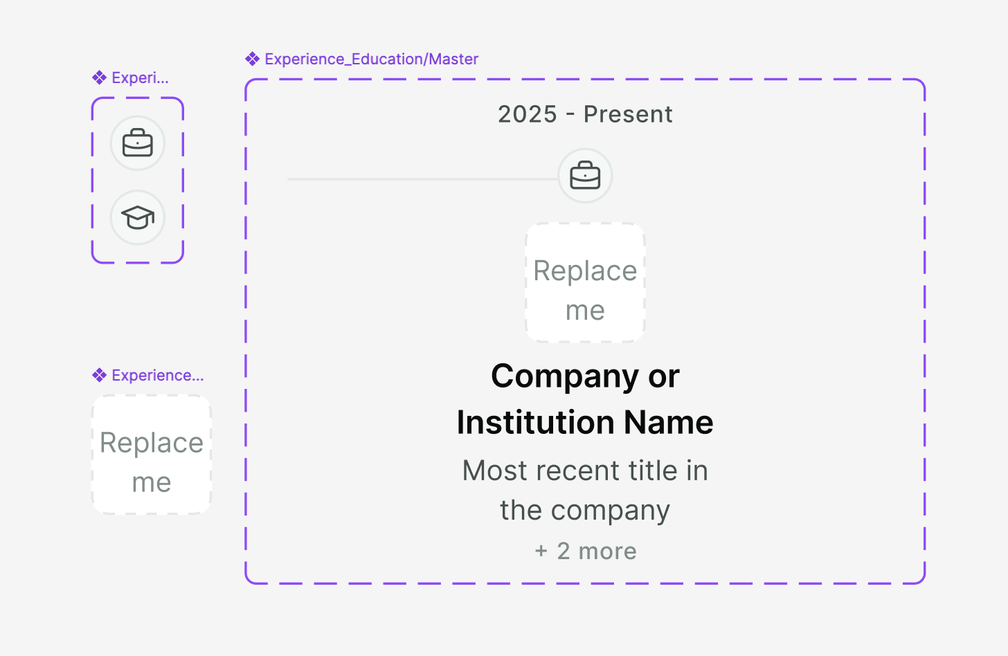
Experience and education were still behaving like two separate lists, even though in real life they shape the same story. So I combined them into one professional timeline, with a small icon distinguishing career moments from education.
Before: experience and education behaved like separate résumé sections.
After: one chronological career story.
One last swap made the structure click: dates above the line, logos below. Time became the organizing structure - and each logo became a stop along the person's career path.
I merged experience and education into one chronological path - dates above the line, logos below - so time became the organizing structure instead of two separate lists.
Keeping the details in context
The timeline gave a quick first impression, but deeper details still needed a home. A separate detail view per role sounded right - tap a job, see more. In practice it disconnected each role from the larger path, and imported entries were uneven: some rich, some nearly empty.
That brought the list back - as a secondary layer, not the main experience.
The timeline gave the first impression. The list gave the depth.
The timeline gives the first impression; a secondary list holds the depth for anyone who wants it.
The outcome
The final profile has two reading modes: a visual career path for quick scanning, and a secondary list for context when the reader wants it. Instead of asking people to scan a résumé, it helps them understand a career path first - and only then choose whether to dig deeper.
Veezo closed before we had usage data on this one. What I do have is interview feedback - people kept pointing at the timeline, saying it felt easier to read, less like scrolling through a résumé.
Imported data still needs product opinion: good UX is deciding what the information should help someone understand.
The profile ended with two reading modes - a visual path to scan, a list for depth. Veezo closed before usage data, but in interviews people kept saying the timeline felt easier to read.
What came next
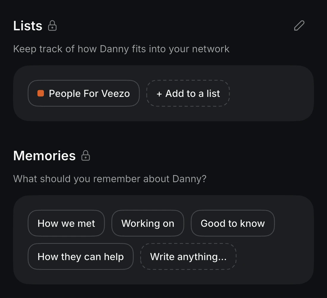
Once the timeline helped people understand a career path, the profile grew layers specific to Veezo: Memories - personal notes and files saved about a person - and Lists, the groups and contexts they belong to. The profile started as a way to make LinkedIn data readable, and grew into a place for building personal context around professional relationships.
If I revisited it today, I'd push that further: less about showing everything I know about a person, more about helping me understand why this person matters now.
The profile later grew Memories and Lists - personal context around each relationship. Next I'd push it toward why a person matters now, not just everything I know about them.